Votre navigateur ne prend pas en charge certaines fonctions utilisées par ce site.
Veuillez utiliser un autre navigateur, comme Chrome.
Part 5: Adjusting the colours on the NYC picture
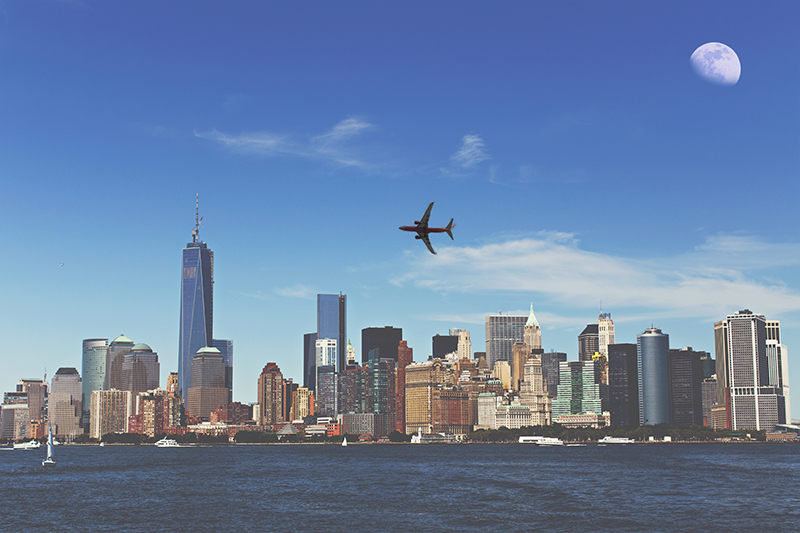
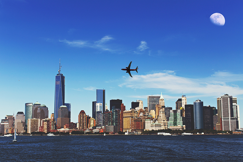
I now have my three photos in my Photoshop document, but I find the colours on the NYC picture rather bland. There is definitely room for some major adjustments.
I've already seen how to make colour adjustments in Part 3. I'll take another look at the picture, comparing it with the colour result I'm aiming for. Let's hide the layers of the bridge and the statue to get a better look.
BeforeAfter
What adjustment should I be doing? The image is washed out. I don't necessarily want to change the hue nor colourize it. Those two options are not what I need. My picture is overexposed, it's too light.
What would then be the settings I should change? If I'm not sure, I can go back and watch the videos in part 3.
THE BRIGHTNESS AND CONTRAST ADJUSTMENT LAYER
I answered:
thumb_up
My best option is to play around with the brightness and contrast settings. To avoid destroying my layer, I will create an adjustment layer above the New York City layer. I will slightly reduce the brightness and push the contrast considerably.
Does it sound like what I wrote?
comment
Note: I heard I could also use the level settings. If I want to know more about that, I could go ahead and google it.
I can now apply the above settings to my New York City picture. I'll click on the button below when I'm done.